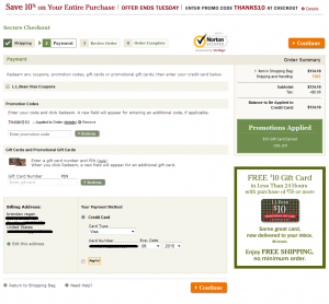
 If you’re like L.L. Bean, and have been exceeding customer expectations for nearly 100 years, you can probably skip this post, because you can get away with a lot of ecommerce checkout design mistakes!
For the rest of us, we need to be very careful about the design of the pages in our shopping carts and checkouts. Prospects have a good deal of anxiety about giving us their money, and small design flaws can cost you the difference between a visit and a sale. If your Conversion Rate could use improvement, optimizing the design of your checkout pages can be a quick, direct route to your goal.
I’m not a frequent L.L. Bean customer, but I recently went through their checkout process, and was amazed by how confusing the layout of their “payment” page was. I had to really look around the page to orient myself and figure out what was going on, and how to move forward.
Like Amazon.com, L.L. Bean’s checkout flow is not intuitive to me, but I assume they’ve done a lot of testing and have optimized for their target audience.
I’m going to point out a few potential issues with the design and layout of their page which you can check against your own checkout pages. Actually, these broad design principles can be used to optimize ANY web page you’re working on.
 Messy, Overcomplicated Grids
The first issue I encountered with the enter payment step of checkout was that the design “grid” of the page was really messy.
The term “grid” refers to a systematic design that is thought out in advance of coding in order to create a pleasing, intuitive layout of page elements. A well-designed grid will make the final page easy to scan, understand, and interact with. A lack of grid structure can have the opposite, negative effect!
Notice how, in the annotated screenshot, there are points along the horizontal axis of the page where elements begin and end. Nothing really seems to “line up” with anything else. None of the call to action buttons are aligned, and there are 3 paragraphs of text that all end at different points. I had a really difficult time scanning this page. It slowed me down, and it broke the “persuasive momentum” that was moving me towards my purchase.
Inappropriate Visual Hierarchy 
“Visual Hierarchy” refers to how designers use design language (proximity, size, color, motion, etc.) to communicate which elements on a page are most important. Doing this effectively directs the prospect’s gaze along an “eye path” that helps them accomplish their goals, and arguably can help persuade them to take a desired action.
I believe L.L. Bean got the visual hierarchy of this payment page all wrong. My gaze was drawn away from the crucial payment entry form, and fixated on elements in the right column. You don’t want to draw your prospect’s gaze away from the main point of a page (e.g. enter payment information) and the primary call to action (e.g. continue with checkout).
Note in the annotated screenshot above where I’ve done an attention heat map simulation using Feng-GUI. Since this is a simulation of how prospects’ gazes might flow through a page, it’s error-prone, but it still gives you an idea of what I was challenged by in my shopping experience. Note how the hot spot isn’t the payment entry form or the primary call to action. It’s instead on a non-crucial message about promotions applied. It’s a nice reassurance, but it’s not at the top of the hierarchy of the page!
Here’s my take on what the visual hierarchy of the page should be:
1. Credit Card entry form
2. Primary Call to Action
3. Point of Action Assurance
4. Order Summary
5. Promo/Coupon Summary
6. Progress Indicator
How to Apply Your New Knowledge
Hopefully, I’ve given you some knowledge and tools you can use to optimize your eCommerce pages. I believe that playing with visual hierarchy is a major part of how I come up with hypotheses and conduct successful tests that raise conversion rates, average order values, and revenue per visitor for my clients.
Assuming you’ve used web analytics data to find which pages in your conversion funnel are under-performing, your next step might be to use free services like fivesecondtest.com or feng-gui.com to get an idea of how your layout grid and/or visual hierarchy might be challenging to prospects.
From there, conduct an experiment to validate that the changes you think will help are indeed helpful. You’ll often find that relatively small design tweaks can make a major improvement for your prospects.
Reminder: Don’t Imitate
The other thought that came out of writing this post was the reminder to not imitate the designs of eCommerce titans like Amazon.com and L.L. Bean just because you read an article about how high their conversion rates are. Their conversion rates are high because they’ve been in business for a long time, or their customer service is amazing, or because they spend millions on mailing out full-color catalogs, NOT necessarily because their page designs are persuasive.
Instead of imitating, use the principles and the process I’ve laid out in this post to find out and validate what works on your site for your target audience.