 I recently came across a concept that got my curiosity revved up: a hosted eCommerce solution provided by none other than Amazon. I’m always interested in learning about up-and-coming eCommerce solutions, and you have to admit that Amazon “knows a thing or two” about eCommerce!
However, this post isn’t about their service, it’s about their landing page. [In doctor’s voice: No, no. Your web service is fine. It’s about your landing page…]
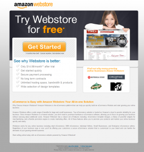
Since my curiosity was engaged, I clicked on a PPC ad to learn more. The landing page (click thumbnail to enlarge) I encountered became the subject of this post because, while it did a whole mess of things “right” in terms of Landing Page Optimization, it failed to speak to the skeptic in me. Read on to learn why this particular failure is so dangerous to conversion.
To highlight a few “best practices” well executed, we’ve got the pretty face making eye contact, the big orange call to action button above the fold, shot of the product in action, simple value proposition bullets high on the page, social proof logos, lack of navigation, and more.
One of my beliefs about marketing optimization is that you can pile on all the “best practices” you want, but if they aren’t crafted to overcome the objections of the target audience, you won’t get the conversion rate you’re looking for.
So what is my beef with this landing page? My beef is that instead of acknowledging and overcoming my skepticism, this landing page design actually increases my skepticism. Also, the navigation options have been reduced down to one single call to action. One that a skeptic will never take. If you’re going to place all your bets on one call to action, you’d better be sure that your offer is unbeatable.
How the page increases my skepticism
The Amazon brand is so strong in eCommerce that there’s no reason they shouldn’t be able to overcome my natural skepticism. But there, in the main headline of the landing page, they give me “free*”! Any use of asterisks and footnoting instantly proves my skepticism is right. So within a few seconds of scanning the page, I already believe that a) the “free*” trial isn’t actually free, and b) the monthly fees they’re advertising simply aren’t accurate.

This is how the author looks when skeptical.
Now that I have skepticism coursing through my veins and my “B.S. Meter” on high alert, I notice that the only action I can take on this page is to “Get Started.” They invite me to “Find out why many growing online businesses choose Webstore,” but none of the logos of companies are clickable for more information. It’s almost as if they’re hiding something.
There is also plenty of copy at the bottom of the page talking about features, but again, nothing is clickable so it’s like they’re expecting me, The Skeptic, to take their word for it. The irony is that the main site has tons of great content to convert me, but I never saw it because I bounced 🙁
So because I’m too suspicious about the pricing, and not persuaded as to the “What’s In It For Me” value of the so-called free trial, I leave without converting. I also leave without them having my email address or any data about my behavior other than another “bounce.”
How your page can deal with my skepticism
So how does a marketing team overcome natural skepticism on a landing page? Here are a few of my thoughts to get you started:
- Assume skepticism exists in the target audience – I find it handy to always have at least one marketing persona in a set be “the skeptical one.”
- Avoid footnoting whenever possible – Yes, I realize you’re doing to have to duke it out with Legal over this one, but you have to at least try to get rid of those glaring asterisks. If you must use footnotes, make them prominent and clear, not light grey, 6-point font at the bottom of the page. Be transparent.
- Think “landing microsite” instead of “landing page” – If you build smaller pages around your core landing page (even tooltips or modal popups), you let the person explore, interact, and answer their own questions without letting them loose into your giant, corporate website.
- Substantiate all claims – by noting that certain brands use their service, Amazon’s marketers essentially claim that other companies are thrilled to be using the product. Probably true, but there needs to be substantiation in the form of content. Double-check all your claims for substantiation.
- Differentiate to diffuse skepticism and objections – let’s not be so arrogant as to assume that our products are beyond criticism or question. Most people on landing pages are looking to learn more, and doing comparisons against other products. So assume that, and position your product accordingly. Think of it like when politicians are allowed a “rebuttal.” What is your rebuttal to what your competition is saying about you? Amazon was wise not to attempt differentiation above the fold, but the text at the bottom of the page is an appropriate place to talk about why other options are inferior.
My calls to action
- Try auditing one of your landing page experiences (including the marketing channel that drives the visit to the landing page) with The Skeptic in mind. Are there things you’d do differently if you knew The Skeptic was a dominant portion of your audience?
- Try testing any/all of my “5 best practices for overcoming skepticism” and see if your audience responds positive or negative.