As we all know, there is now more web data, and more web analytics reports, than there are hours in the day. One could literally do nothing but stare at web analytics reports all day every day. Unfortunately, that approach would be well beyond the point of diminishing returns.
The fact is that web analysts aren’t paid to stare at web analytics reports all day. They’re paid to provide data-driven insights to drive the business. In the absence of insights, they are paid to ask thought-provoking questions that have the potential to become marketing insights.
Given the scarcity of time to come up with insights and the overabundance of reports, I believe it’s important to have your own “short list” of super-powerful reports or analyses that can quickly give you insights or things to talk about with your marketing colleagues.
I’m going to share one of mine with you. It consistently either a) gives me insights about the prospects of a given website or b) gets my mind buzzing with questions that can be further investigated. At it’s core, this analysis is about entrance keywords, but I use it to understand both user intent (the need/desire behind the query) and the quality of traffic that visits the site.
 Step 1. Pull an entrance keyword report. It can be a long or short time window, it can be paid or organic search (or blended), and it can be segmented if you want. It’s probably best to pull a generic report, then get more specific over time. In my example [click to enlarge], I’m filtering for organic search, I have a segment applied, AND I’m doing an exclude filter on “(not provided)” as a keyword. Yes, I’m a show-off 😉
Step 2. Do whatever your tool requires to “show more rows” so that you can export the report to a spreadsheet. In Google Analytics, use the “Show rows” dropdown at the bottom of the report table.
Step 3. Export to spreadsheet format. In Google Analytics, use the “Export” button at the top of the report, and the “csv” format option. Gasp! Yes, we’re leaving our web analytics womb and venturing into the ugly-but-useful world of spreadsheets!
Step 4. Format data. Delete everything except the keywords. I want a simple column of keywords going down column A. You may want to scan the keywords and scrub out any useless data, e.g. junk queries, machine queries, etc.
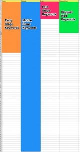
Step 5. Analyze and format. Create 4 new column headings, “Early Buying Stage,” “Middle Buying Stage,” “Late Buying Stage,” and “Disqualified Traffic.” These are the categories that you’re going to sort each keyword into. Examine each keyword. Yes, this is actual analysis, not just pulling data! Think about, and make your best guess on, which category the keyword’s intent matches.
Let’s start with disqualified traffic. Put keywords in this column that show that the visitor is highly unlikely to convert into a lead or a sale. Examples might be keywords that show the person is looking for employment, like “jobs at ______.” Or, it’s a keyword that has multiple meanings. For example, you sell and install roof shingles, and the keyword is “how do i cure myself of shingles.” Any keyword that indicates the visitor ended up outside your primary conversion funnel could end up in this column. Don’t worry if there aren’t many keywords in this column. DO worry if the majority of keywords are in this column!
On to “early,” “middle,” and “late” columns. This part of the analysis is determining where in the buying process (or ‘consideration cycle’) the prospect is, as indicated by their entrance keyword. This part is definitely more “art” than “science,” by the way.
If you’ve not done buying stage analysis before, a simple way to think about it is that “early” stage buyers are in a self-educating mode, “middle” stage buyers are kicking the tires and comparison shopping, and “late” stage buyers are either ready to convert, or are trying to confirm a few last details before doing so. For a more detailed exploration of this concept, you can read a post I wrote in 2010 here.
 The general pattern that I see is that most sites are made up of mostly Early keywords, or mostly Middle keywords, and very seldom are dominated by Late keywords. See the example [click to enlarge] for how an example analysis broke out by category.
Merely looking at the proportions of the different columns tells you some things about the quality of the traffic, and how much “nurturing” they might need in order to convert. If you’re dealing with lots of Early Stage prospects, does your site offer high-level, educational content that they can consume?
If your marketing efforts are driving visitors that you’ve flagged as Disqualified, you can work with your colleagues to try and adjust where and how you’re advertising. If the “mix” is healthy, and your site still doesn’t convert, you at least know that you can focus primarily on the site experience, as opposed to traffic quality.
Another fun next step is to turn each column of keywords into a segment (in Google Analytics) that you can apply to your reports. Ever wondered how an Early Stage prospect converts in comparison to a Middle Stage? Follow me.
Turn each column into a pipe-delimited text string. There may be a better/faster way to do this, but I:
1) Copy the column, “paste special > transpose” in Excel
2) Copy the new horizontal row of keywords, and paste into Notepad
3) Copy the empty “tab” space between one of the keyword sets
4) Do “edit > replace” and paste the “tab” into the find, replacing it with a pipe symbol “|”
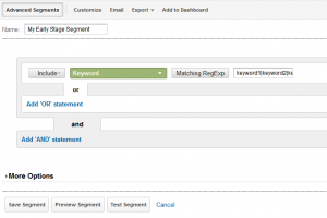
 Now you have a string of keywords separated by pipes. Back in Google Analytics, create an Advanced Segment to “include” “keyword” “Matching RegEx”. [Click screenshot to enlarge]. Paste the text string of keywords into the entry field and test/save. Repeat for the other 3 columns of keywords, and now you have various “intent” segments you can apply and have fun with. Start by showing your boss your main conversion rate segmented by buying stage.
Any questions? Have any of you played with this type of analysis before? Did you find it worthwhile given the effort it takes to get it going? Let a geek know!