3 Ways to Lose an eCommerce Sale

What you’re about to read was inspired by a real-life online shopping experience. I won’t mention the guilty site, but I’ll say they sell clothing and jewelry to young urbanites.

As I relate the following three eCommerce mishaps, be thinking about whether you can eradicate all of them from your business by the time the “Holiday Rush” hits. ALL are preventable if you start today and take one item at a time.

Let’s start at the “precipitating event;” the spark that lit my desire to shop online…

1. An email with a promo code arrived. w00t! They paid attention to past purchases, and sent me a great promotion: 10% off a brand I’ve purchased before, and free shipping if the order exceeds a certain amount.

How They’re Losing Sales: Despite not mentioning an expiration date for the promo code, it was expired by the time I reached checkout. I’m notoriously slow for opening emails from online retailers, but I bet I’m not alone. Creating a sense of urgency with an expiration date is fine, but remember that shoppers sometimes go weeks without going through their personal email accounts to read your promo codes.

And now it’s Customer Service’s turn…

2. When the promo code came up as expired, I was understandably disappointed. I’d just spent a fair amount of my weekend building up enough value in my shopping cart to qualify for the free shipping (Yes, I’m cheap.) My credit card was out of my wallet. So, I clicked the live chat in the cart to see if they’d extend the promo code, or give me an equivalent one.

How They’re Losing Sales: The live chat agent, while polite and earnest, was not able to do anything to help me (be a cheapskate). They weren’t empowered by their employer to get creative and save me from abandoning my cart. They suggested I call the “real” Customer Service during regular M-F business hours. So my guess is that the live chat is being outsourced, which is fine, but if they aren’t empowered to save sales, they’re probably not giving good ROI.

Now stepping up to the plate, Technology

3. I came back the next day with the intention of calling the retailer and trying to get them to extend the promo code or give me the equivalent deal. So, I returned to the site and clicked “My Cart” to review what I’d put in there, and have it on-screen when I called.

How They’re Losing Sales: They didn’t save my cart! So many sites are saving cart items via cookie that I assumed my items would be there the following day or week. So now I’m definitely not going to re-build my cart AND call them to try and negotiate the promo code. I’m going to just repress the whole memory…maybe I’ll even forget the retailer’s brand in the process!

These 3 blunders may seem unconnected from a business perspective, but from a buyer perspective, they were all part of a persuasion scenario that broke down and turned a VERY motivated shopper into a lost sale.

I do like the site, and hope they can address these issues and stay in business. But they and others will have a very painful holiday sales season if they don’t treat the disparate parts as a unified buying experience that must be nearly flawless to be profitable.

[A version of this post was originally published August 11th, 2009 on GrokDotCom.com, an award-winning, but now defunct, Marketing Optimization blog.]
The Shopping Cart: Are You Answering These 5 Silent Questions?

The ecommerce shopping cart is a great place to run tests because simple changes (layout, copy, color, etc.) often yield fantastic results. But once you’ve hit a point of diminishing returns with “easy” A/B tests, you’ve got to dig in deeper and find out if you’re answering customers’ silent questions. I call them “silent questions” because customers don’t ask them of site owners directly. They simply buy from you if their questions are answered, and buy from your competitor if they go unanswered!

There are unanswered questions in the minds of our customers that we think are obviously answered on the page, but guess what? We’re blind to the truth that our customers miss things that we put in front of them. We’re too close to our own designs and user experiences to be objective. (If you’ve ever witnessed a usability test, you know the pain I’m referring to).

If you’re not sure about what those unanswered questions are, specific to your business, you can back up a few steps and use personas or user testing to uncover them. Personas help you empathize target customers (not you) and imagine their specific shopping questions. User (usability) tests can be designed to uncover customer questions by assigning a shopping task and asking the subject(s) open ended questions and encouraging them to “think out loud.”

For example, here are 5 key, unanswered questions (beyond shipping costs) of the shopping cart:

  1. Do you offer alternate forms of payment (aside from credit card)?
  2. Are you safe and secure?
  3. Why are you asking for this information?
  4. Do I have to set up an account to buy?
  5. Do I get to review my order before we transact?

I recently bought a Father’s Day present online from a gift retailer, and their overall shopping cart process was “OK.” I would give it a “B-” grade; it was good enough to get me through the purchase without bailing, but not nearly good enough to earn brand loyalty. But, they did a good job of clearly answering the 5 Questions, and it was enough to help them “Get The Cash.”

Are you adequately answering the 5 unanswered questions? You won’t know unless you’re doing customer research and experimentation. Whether your confidence level is low, high, or somewhere in between, I know you could run some interesting tests to validate your assumptions about how well you’re doing, and you might increase your funnel conversion rate in the process! Want help? Let me know.

[Originally published June 22nd, 2009 on GrokDotCom.com, an award-winning, but now defunct, Marketing Optimization blog.]

Buying Stage Mismatch In Your Customer Experience

Every visitor comes to your site in their own “stage” of their individual buying process. The buying stages are actually a wide spectrum, but I generally break them into Early, Middle, and Late buying stages:

  • Early stage means that the visitor has a problem, and is looking for a solution. They may not know who you are, or that your product/service solves their problem.
  • Middle means that they have an intention to buy a product or service that solves their problem, but not necessarily from you.
  • Late means that they’re persuaded to buy from you, and intend to “close the deal.”

Sometimes, websites seem to be doing everything right, but the Key Performance Indicators (KPIs) just aren’t as high as everyone expects. Their sites are functional, accessible, usable, and intuitive. Their look and feel is credible, and their content is high quality. So why do their visitors not behave as we expect? Why do well-planned and well-executed scenarios (e.g. PPC ad → landing page → lead generating form → thank you page) not always convert?

You guessed it: Buying Stage mismatch.

Buying Stage mismatch is when your selling process doesn’t jive with the visitor’s buying process. It’s when your conversion funnel is designed for a buying stage that the visitor isn’t in. Take a look at your site’s conversion funnel…it’s most likely designed for Late Stage buyers, right? Take a look at one of your PPC campaigns…are you showing Early Stage searchers a Middle Stage ad that sends the visitor down a Late Stage funnel? Poor visitor 🙁

The key point is to be aware that multiple buying stages are traversing your designed scenarios. It’s fine if your funnel is fine-tuned to Late Stage buyers, but do you have easy navigation paths to let an Early or Middle stage visitor branch out and get more information? It’s fine if your PPC landing pages are perfect for a Middle Stage searcher, but can an impatient Late Stage searcher “Buy Now”?

How do you identify buying stages to improve your scenarios?

A few ways, using basic analytics tools and skills, are:

  • Look at your keyword lists (in-site search, organic keywords, and paid keywords) and start segmenting by buying stage. Guessing is OK.
  • Look at click paths and navigation (which pages would be attractive/informative to the various stages?)
  • Look for those who bail out of conversion funnels (it could be that they’re not ready to buy)
  • Look at entrance sources (organic vs. PPC vs. referrals vs. direct visits)

[Originally published February 18th, 2009 on GrokDotCom.com, an award-winning, but now defunct, Marketing Optimization blog.]


Offline Reps Need to Care About the Online Experience

I finally tracked down that hard to find item online. It was the right size, the right shape, the right finish, and a tolerable price…and free shipping!

I clicked the nice, big, obvious “Add to Cart” button to dive headlong into the conversion funnel. ERROR. Some jargon written by a software developer. No phone number. I did what anyone in the mood to buy would do – I clicked the back button and tried again. ERROR. I clicked back again, and luckily for this eTailer, the toll free number was prominently displayed in the active window, AND I didn’t have any of their competitor sites top-of-mind.

Rep: Welcome to [store with error-ridden website.com], how can I help you?

Me: Well, I’m trying to buy [Item X] on your website, but I can’t, so can you start by checking whether it’s in stock?

Rep: OK, I can help you buy [Item X] no problem.

Now, let’s imagine that conversation as it should have been…

Rep: Welcome to [store with error-ridden website.com], how can I help you?

Me: Well, I’m trying to buy [Item X] on your website, but I can’t, so can you start by checking whether it’s in stock.

Rep: Oh no, I’m so sorry to hear that! What happened? Can you describe what you were doing when our website failed you? Did you get an error message? What browser were you using?

Note the difference? A little empathy would’ve been effective and memorable…maybe even blog-worthy. Don’t sound matter-of-fact that your website blew up, or I’ll never use your online channel again, and your brand has been damaged.

And I’m sure the technical team behind that website would’ve LOVED to get their hands on the error code that I’d written down and done some tinkering. And they should’ve, because that website was bleeding money yesterday.

[Originally published September 18th, 2008 on GrokDotCom.com, an award-winning, but now defunct, Marketing Optimization blog.]

Are Your Digital Experiences 2017…But Your Forms 2007?

[Originally published September 16th, 2008 on GrokDotCom.com, an award-winning, but now defunct, Marketing Optimization blog.]

I was recently reminded, for the millionth time it seems, that forms are the “bread and butter” of almost every website, app, and digital experience. Whether it’s the Contact Us form on a B2B site, the Sign Up form on a social networking site, or the Checkout of an eCommerce site, they all have forms in common. And in every case, forms are what stands between our site visitors and the action we’ve persuaded them to take.

The irony is that companies spend thousands, sometimes millions, on making their sites functional, accessible, usable, intuitive, and sometimes even persuasive, but don’t always spend enough on making their transactional experiences (forms) as optimized as possible. Add to that the money spent starting a relationship with customers via online or offline marketing. And when it’s time to take that relationship the next level and close the deal, online forms have the responsibility.

So like the title of this post, I have questions:

  • How much have you spent on your homepage and landing pages in the last 12 months? (Design, UX, Content, etc.)
  • How much have you spent on your forms?
  • How many resources work on your homepage and landing pages? (Design, UX, Content, etc.)
  • How many resources work on your forms?
  • Do you A/B and Multivariate test your homepage and landing pages?
  • Do you A/B and Multivariate test your forms?
  • Do your homepage and landing pages employ the latest technology, code, and standards?
  • Do your forms…?

If you’re like most companies and marketing organizations, and answered honestly, there was a heavy skew towards focusing on digital experiences, yet oddly little focus on forms, the places where the “rubber meets the road.”

Of course homepages and landing pages are important, and deserve lots of attention. But don’t forget that the bottom of your conversion funnel is where all the serious action is. It’s where dollars either flow into your bank account or…elsewhere.

So what can you do to start to rebalance the focus and give your forms more love?

  1. Start a “Forms Task Force” within your company–make it cross-disciplinary–and take a good, hard look at your forms.
  2. Conduct User Tests that prompt interaction with your forms.
  3. Look at every question on your forms. To paraphrase Web Form Design by Luke Wroblewski, consciously decide to “keep,” “cut,” “postpone,” or “explain” every question you ask your customers.
  4. Once you’ve revisited your forms, begin (or revitalize) the ongoing process of form testing and optimization.

Information Overload: Why Less is the New More

[Originally published June 24th, 2008 on GrokDotCom.com, an award-winning, but now defunct, Marketing Optimization blog.]

A new report entitled Information Overload: We Have Met the Enemy and He Is Us was written up recently in the Wall Street Journal and the New York Times. Commissioned by Basex, it details how information overload, particularly task interruptions, costs the Enterprise $650 billion a year in lost productivity.

That’s a very large price to pay for having everything at our fingertips, all the time, in any format.

Our decision-making processes can’t always keep up with our choices. The same challenge applies to website design and content. The Web is a fantastic place to shop, research, and be entertained, but sometimes when I’m online, I notice physical fatigue when I’m trying to figure out where to go next!

When I’m evaluating a vendor’s Services page, should I:

  • Sign up for their newsletter?
  • Read about the awards they’ve won?
  • Look at a list of clients?
  • Read the CEO’s blog?

When I’m shopping for a health supplement, should I:

  • Read about related products?
  • Read about their latest “green” program?
  • View my empty shopping cart?
  • Become an affiliate?

Even though we come to a website with the best intentions, we’re by nature drawn to the shiny distractions that marketers and designers put along our path. We go down rabbit holes in websites and sometimes by the time we find our way back to the trail, we’ve lost our momentum . . . or maybe we’ve been interrupted and have to go back to work 😉

So I’m wondering: How much money is lost each year because we overload our potential customers with information on our web pages? How many visitors are driven away by cluttered designs, too many messages, too many offers, and too many choices?

Here’s the problem: Marketers naturally want to use messaging, offers, promotions and more to persuade web visitors. But in their efforts, they often contribute to information overload, which is proven to hamper the decision-making process. Also, companies tend to add more content to their websites over time and rarely retire content that’s outdated or irrelevant.

The solution: Most web pages should have only one primary goal. If there are alternate options, offers, or next steps, that’s fine. But don’t interrupt the task at hand, and don’t overload your visitors with distractions.

The one exception I can think of is the homepage, which should, at a minimum, a) communicate Unique Value Proposition, and b) route visitors.

Should you remove these secondary goals and choices? Maybe, but sometimes making them less prominent is enough to move the needle. It comes down to a business decision whether your “Sizzlin’ Hot Summer Giveaway” promotion is worth distracting a certain percentage of visitors from their primary goal.

What if you don’t know the goal of all of your site’s pages? You could start with rediscovering who your customers really are, or some analysis of your website’s “data dump,” or you could hypothesize and run some tests. Sometimes the purpose of a page is simply to present options. That’s fine, but don’t distract visitors from understanding their options and making a decision.

So let’s get practical here:

  • Category page primary goal = route visitors to sub-category or product page
  • Product page primary goal = persuade visitors to purchase
  • In the News page primary goal = build brand credibility
  • Shopping cart page primary goal = get the cash!
  • General content page primary goal = build persuasive momentum

Although it seems hard at first, it’s actually pretty easy to find a single, primary goal for most pages on your site. Then you have the harder task of deciding how to do away with unnecessary distractions, get rid of design clutter, and allow visitors freedom without information overload.

Sometimes having a new pair of eyes look at your site can really speed this process up.

If you’re overloading customers with info, you’re not alone. Many world-class, million-dollar sites are guilty of information overload, and even the best online marketers need to work on it constantly.

Best of luck. To avoid information overload, let’s focus on answering three essential questions of site Optimization:

  • Who is your visitor?
  • What action do you want them to take?
  • What will persuade them to take that action?

Checkout Design Mistakes: Grid and Visual Hierarchy

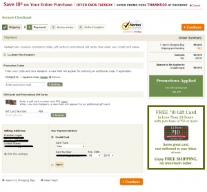
ll bean payment pgIf you’re like L.L. Bean, and have been exceeding customer expectations for nearly 100 years, you can probably skip this post, because you can get away with a lot of ecommerce checkout design mistakes!

For the rest of us, we need to be very careful about the design of the pages in our shopping carts and checkouts. Prospects have a good deal of anxiety about giving us their money, and small design flaws can cost you the difference between a visit and a sale. If your Conversion Rate could use improvement, optimizing the design of your checkout pages can be a quick, direct route to your goal.

I’m not a frequent L.L. Bean customer, but I recently went through their checkout process, and was amazed by how confusing the layout of their “payment” page was. I had to really look around the page to orient myself and figure out what was going on, and how to move forward.

Like Amazon.com, L.L. Bean’s checkout flow is not intuitive to me, but I assume they’ve done a lot of testing and have optimized for their target audience.

I’m going to point out a few potential issues with the design and layout of their page which you can check against your own checkout pages. Actually, these broad design principles can be used to optimize ANY web page you’re working on. Continue reading

Copy Matters: 30 Minutes for a 10% Lift

Pad of Paper & PenOne of the more common excuses I hear for marketers not conducting experiments on their websites is a “lack of resources.” This generally refers to not having designers and developers at their disposal to create new versions of site pages, new graphics, new layouts, etc.

However, that is not an excuse from testing. That is perhaps an excuse from “radical redesign” testing. But there are still ways to run tests and get conversion rate lifts without tapping those resources. If you have access to a copywriter, or can write a bit of copy yourself, there’s plenty of testing (and learning) you can do, and I’ll give you an example in this post. Continue reading

Optimize Your Perpetual Shopping Cart for the Holidays

I’ve started to see more and more articles about prepping your site, your marketing, and your conversion funnel for the 2012 Holiday Season, so I thought I’d post about Perpetual Shopping Carts – a crucial site experience for multi-item gift shoppers. Continue reading

Why The “Recipe” Multivariate Test Approach is Flawed

chef with recipe with red x overlayOK, settle down. I’m not saying that Multivariate testing is “flawed.” It’s a perfectly useful way to test. However, I recommend against looking for the right “recipe” before you know what your audience is hungry for!

By “recipe,” I’m referring to the popular approach to multivariate testing where a page is first broken into its discrete components (e.g. navigation, call to action, image, headline, etc.). Then, testers create different versions of all the components identified. Finally, all the variations are thrown into a multivariate experiment that runs until the best combination of variations of page components is accidentally found.

To illustrate, I’ll tell you a true story that a client told me. Continue reading