Are Your Digital Experiences 2017…But Your Forms 2007?

[Originally published September 16th, 2008 on GrokDotCom.com, an award-winning, but now defunct, Marketing Optimization blog.]

I was recently reminded, for the millionth time it seems, that forms are the “bread and butter” of almost every website, app, and digital experience. Whether it’s the Contact Us form on a B2B site, the Sign Up form on a social networking site, or the Checkout of an eCommerce site, they all have forms in common. And in every case, forms are what stands between our site visitors and the action we’ve persuaded them to take.

The irony is that companies spend thousands, sometimes millions, on making their sites functional, accessible, usable, intuitive, and sometimes even persuasive, but don’t always spend enough on making their transactional experiences (forms) as optimized as possible. Add to that the money spent starting a relationship with customers via online or offline marketing. And when it’s time to take that relationship the next level and close the deal, online forms have the responsibility.

So like the title of this post, I have questions:

  • How much have you spent on your homepage and landing pages in the last 12 months? (Design, UX, Content, etc.)
  • How much have you spent on your forms?
  • How many resources work on your homepage and landing pages? (Design, UX, Content, etc.)
  • How many resources work on your forms?
  • Do you A/B and Multivariate test your homepage and landing pages?
  • Do you A/B and Multivariate test your forms?
  • Do your homepage and landing pages employ the latest technology, code, and standards?
  • Do your forms…?

If you’re like most companies and marketing organizations, and answered honestly, there was a heavy skew towards focusing on digital experiences, yet oddly little focus on forms, the places where the “rubber meets the road.”

Of course homepages and landing pages are important, and deserve lots of attention. But don’t forget that the bottom of your conversion funnel is where all the serious action is. It’s where dollars either flow into your bank account or…elsewhere.

So what can you do to start to rebalance the focus and give your forms more love?

  1. Start a “Forms Task Force” within your company–make it cross-disciplinary–and take a good, hard look at your forms.
  2. Conduct User Tests that prompt interaction with your forms.
  3. Look at every question on your forms. To paraphrase Web Form Design by Luke Wroblewski, consciously decide to “keep,” “cut,” “postpone,” or “explain” every question you ask your customers.
  4. Once you’ve revisited your forms, begin (or revitalize) the ongoing process of form testing and optimization.
Information Overload: Why Less is the New More

[Originally published June 24th, 2008 on GrokDotCom.com, an award-winning, but now defunct, Marketing Optimization blog.]

A new report entitled Information Overload: We Have Met the Enemy and He Is Us was written up recently in the Wall Street Journal and the New York Times. Commissioned by Basex, it details how information overload, particularly task interruptions, costs the Enterprise $650 billion a year in lost productivity.

That’s a very large price to pay for having everything at our fingertips, all the time, in any format.

Our decision-making processes can’t always keep up with our choices. The same challenge applies to website design and content. The Web is a fantastic place to shop, research, and be entertained, but sometimes when I’m online, I notice physical fatigue when I’m trying to figure out where to go next!

When I’m evaluating a vendor’s Services page, should I:

  • Sign up for their newsletter?
  • Read about the awards they’ve won?
  • Look at a list of clients?
  • Read the CEO’s blog?

When I’m shopping for a health supplement, should I:

  • Read about related products?
  • Read about their latest “green” program?
  • View my empty shopping cart?
  • Become an affiliate?

Even though we come to a website with the best intentions, we’re by nature drawn to the shiny distractions that marketers and designers put along our path. We go down rabbit holes in websites and sometimes by the time we find our way back to the trail, we’ve lost our momentum . . . or maybe we’ve been interrupted and have to go back to work 😉

So I’m wondering: How much money is lost each year because we overload our potential customers with information on our web pages? How many visitors are driven away by cluttered designs, too many messages, too many offers, and too many choices?

Here’s the problem: Marketers naturally want to use messaging, offers, promotions and more to persuade web visitors. But in their efforts, they often contribute to information overload, which is proven to hamper the decision-making process. Also, companies tend to add more content to their websites over time and rarely retire content that’s outdated or irrelevant.

The solution: Most web pages should have only one primary goal. If there are alternate options, offers, or next steps, that’s fine. But don’t interrupt the task at hand, and don’t overload your visitors with distractions.

The one exception I can think of is the homepage, which should, at a minimum, a) communicate Unique Value Proposition, and b) route visitors.

Should you remove these secondary goals and choices? Maybe, but sometimes making them less prominent is enough to move the needle. It comes down to a business decision whether your “Sizzlin’ Hot Summer Giveaway” promotion is worth distracting a certain percentage of visitors from their primary goal.

What if you don’t know the goal of all of your site’s pages? You could start with rediscovering who your customers really are, or some analysis of your website’s “data dump,” or you could hypothesize and run some tests. Sometimes the purpose of a page is simply to present options. That’s fine, but don’t distract visitors from understanding their options and making a decision.

So let’s get practical here:

  • Category page primary goal = route visitors to sub-category or product page
  • Product page primary goal = persuade visitors to purchase
  • In the News page primary goal = build brand credibility
  • Shopping cart page primary goal = get the cash!
  • General content page primary goal = build persuasive momentum

Although it seems hard at first, it’s actually pretty easy to find a single, primary goal for most pages on your site. Then you have the harder task of deciding how to do away with unnecessary distractions, get rid of design clutter, and allow visitors freedom without information overload.

Sometimes having a new pair of eyes look at your site can really speed this process up.

If you’re overloading customers with info, you’re not alone. Many world-class, million-dollar sites are guilty of information overload, and even the best online marketers need to work on it constantly.

Best of luck. To avoid information overload, let’s focus on answering three essential questions of site Optimization:

  • Who is your visitor?
  • What action do you want them to take?
  • What will persuade them to take that action?

Checkout Design Mistakes: Grid and Visual Hierarchy

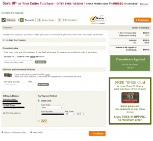
ll bean payment pgIf you’re like L.L. Bean, and have been exceeding customer expectations for nearly 100 years, you can probably skip this post, because you can get away with a lot of ecommerce checkout design mistakes!

For the rest of us, we need to be very careful about the design of the pages in our shopping carts and checkouts. Prospects have a good deal of anxiety about giving us their money, and small design flaws can cost you the difference between a visit and a sale. If your Conversion Rate could use improvement, optimizing the design of your checkout pages can be a quick, direct route to your goal.

I’m not a frequent L.L. Bean customer, but I recently went through their checkout process, and was amazed by how confusing the layout of their “payment” page was. I had to really look around the page to orient myself and figure out what was going on, and how to move forward.

Like Amazon.com, L.L. Bean’s checkout flow is not intuitive to me, but I assume they’ve done a lot of testing and have optimized for their target audience.

I’m going to point out a few potential issues with the design and layout of their page which you can check against your own checkout pages. Actually, these broad design principles can be used to optimize ANY web page you’re working on. Continue reading

3 Signs Your Personas Are Broken

danger iconLast month, the venerable Bryan Eisenberg wrote on his blog about Content Marketing Personas. The article was a good reminder for us that there are a lot personas out there in the marketing world, and many of them are sub-par if not dangerous.

I especially liked his suggestion that readers explore his “conversion trinity” on paid ads and landing pages using existing personas to see if they were up to the task of helping optimize a landing page experience. He has promised us more columns about “getting personas right” in the future, so I recommend you keep an eye out for those.

Coincident with me reading Bryan’s post, I was doing an on-site consulting engagement with a new client. They were looking to redesign a microsite with the goal of boosting lead conversion rate. I was relatively unfamiliar with their marketing efforts, so I asked if they had marketing personas. They answered, “Yes,” and I was delivered an 8Mb PDF with a professional layout, high-quality stock images, and content that was backed by legitimate research.

I deleted it minutes later.

Why did I delete these personas, choosing to “start from scratch” instead of leverage a document that had obviously taken many hours to produce?!? I won’t answer that specifically about this client’s personas, but it’s my segue into my 3 warning signs that your personas may be toxic. If the personas you’re using to do Optimization (or any Marketing) show any of these traits, you may be shooting yourself in the foot. Continue reading

Whoa! A Digital Agency Gets Their Homepage Right

When it comes to web design that “converts,” i.e. efficiently persuades prospects to take a desired business action, the websites of digital agencies haven’t typically been high on my list for praise.

Often times, the sites of digital agencies have over-relied on flash, high-resolution imagery, or inventive navigation to persuade their prospects that they should engage with the site and eventually take a desired action.

Further, the philosophy of “creativity for creativity’s sake” pervades many agencies, and the web designs they provide to clients often under-perform in terms of business KPIs like conversion rate and revenue.

Hence, many practitioners of Conversion Optimization distance themselves from traditionally “creative” agencies, instead testing their way to designs that are often aesthetically plain (even boring), but convert well.

Note: this isn’t always the fault of agencies. Their clients are often fixated on aesthetic design and aren’t thinking enough about website business performance. And, as we know, the client is always right when you work at an agency.

All of this contributes to my bias. Enter the homepage of POSSIBLE, a digital agency that I was introduced to recently. I was surprised to see that their homepage is doing some things really well that we can learn from in terms of persuasion and conversion optimization. Continue reading

Images Blocked Email of the Month: June 2012

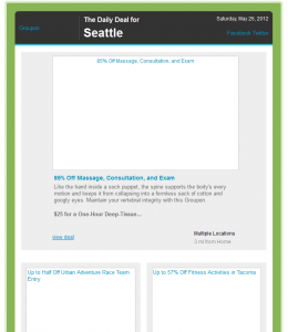
groupon email with images blockedYes, another month is upon us, which means that it’s time for another installment of “Images Blocked Email of the Month”!

This post is different, though. After several months of bashing email marketers for not optimizing their emails for image suppression, I thought it would be refreshing to highlight and praise some email marketers that are doing a good job in this area. Continue reading

Conversion-Friendly Website Redesigns Need these 7 Factors

numeral sevenThose who’ve worked with me know that I’m not a fan of website redesign projects. I much prefer testing and incremental change.

Why? Because I’ve been involved in website redesign projects that were catastrophes, and many of my clients have admitted that they engaged my expertise in conversion rate optimization because they redesigned and their new site converted worse than their old one!

But, once in a while, a redesign is the right course of action. Maybe it’s part of a re-branding effort, maybe it’s simply a “political” requirement, or maybe the current site will require so much work to optimize that it’s not cost-efficient.

If you find yourself heading down the path of a redesign project, there are factors that your team can focus on to ensure that the redesigned site does more than just look nice in browsers on devices. It needs to perform as part of your marketing system and help your company achieve business goals! Building these 7 factors into your project will set you up for success. Continue reading

How To Optimize Customer Testimonials Part 2: Designing A Test

In my Part 1 post about optimizing customer testimonials, I laid out my CAPP framework for thinking about the various aspects of a testimonial and the variables you might improve on and/or test.

In this post, I want to illustrate how I would apply this framework using a multivariate test to see which optimized combination of factors would increase conversions the most. Continue reading