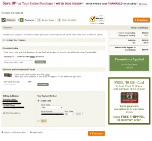
 If you’re like L.L. Bean, and have been exceeding customer expectations for nearly 100 years, you can probably skip this post, because you can get away with a lot of ecommerce checkout design mistakes!
For the rest of us, we need to be very careful about the design of the pages in our shopping carts and checkouts. Prospects have a good deal of anxiety about giving us their money, and small design flaws can cost you the difference between a visit and a sale. If your Conversion Rate could use improvement, optimizing the design of your checkout pages can be a quick, direct route to your goal.
I’m not a frequent L.L. Bean customer, but I recently went through their checkout process, and was amazed by how confusing the layout of their “payment” page was. I had to really look around the page to orient myself and figure out what was going on, and how to move forward.
Like Amazon.com, L.L. Bean’s checkout flow is not intuitive to me, but I assume they’ve done a lot of testing and have optimized for their target audience.
I’m going to point out a few potential issues with the design and layout of their page which you can check against your own checkout pages. Actually, these broad design principles can be used to optimize ANY web page you’re working on. Continue reading →
 On December 6 of last year, I presented a session at the BestPractices conference in Seattle, WA. BestPractices is a conference and webinar series presented by Analytics Pros and focused on, you guessed it, “best practices” around digital analytics and optimization.
 I’ve written a fair amount over the years about using the
  I’m going to answer both in this post as I lay out a basic framework for how to “do” web analytics in the context of Optimization. I compare web data analysis to looking with different “lenses” at the same set of data depending on the context. For example, if I’m doing analysis on “site performance,” I would take a different view of the data than if I were doing “campaign analysis” or “content performance analysis.”
 If you’re like
  One of the more common excuses I hear for marketers not conducting experiments on their websites is a “lack of resources.” This generally refers to not having designers and developers at their disposal to create new versions of site pages, new graphics, new layouts, etc.
 Last month, the venerable Bryan Eisenberg wrote on his blog about
  For years, I’ve been searching for better and better ways to explain what it is that I do as a
 With all of the quality blogs devoted to Conversion Optimization tips and best practices, I’ve not come across any posts related to the different kinds of documents required to be successful in a conversion optimization and testing effort.